


Take a Bow Peel & Stick
€1.50
This rich and joyful teal. Take a Bow is a bright colour that combines well with red-toned hues. Pair it with a crisp white for a fresh look, or tone it down with any dark grey shade in the collection.
| Weight | 0.014 kg |
|---|---|
| Product | Interior Paint, Metal, Wood |
| Size | 0.65L, 1L, 2.6L, 5L |
Complementary Palettes…
A red-based neutral. Marshmallow is a warm off-white with a creamy softness. Bright whites will bring out the red, making it look pink or pair with darker shades like Putty or Just White for a more mellow look.
This product has multiple variants. The options may be chosen on the product page
A true pink. Petal is a mid pink with a delicate softness that has a calming quality. Pair with dusty greens or other delicate neutrals for a tranquil feel.
This product has multiple variants. The options may be chosen on the product page
A crisp white with a hint of true grey. Moon Mist is a subtle neutral with a fresh warm tone. It can be used as a wall colour for a contemporary space. It's equally beautiful when used on ceilings and woodwork when combined with greys or darker neutrals.
This product has multiple variants. The options may be chosen on the product page
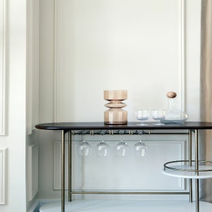
A rich grey with a hint of blue. Etching is a timeless shade. The undertone of blue gives Etching a crispness that makes it the ideal shade for a contemporary space. Pair with warmer tones for a more relaxed feel.
This product has multiple variants. The options may be chosen on the product page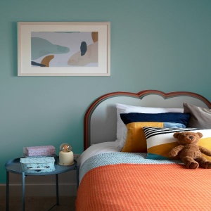
A light and milky teal. Holiday Mode is a beautiful green-blue tone. It's ideal for use in children's bedrooms or anywhere you want to bring some joy.
This product has multiple variants. The options may be chosen on the product pageRelated products

A deep dusty orange. Carnival is a warm and cheerful shade. It is beautiful when paired with a crisp white like Icing Sugar and very dramatic when used with black or dark grey.

This chalky cobalt blue. Twilight has a hint of mauve and comes to life when paired with whites and bright shades. In contrast, however, it is calmer and more restful when used in darker spaces.

A delicate pastel pink. Bon Bon is a beautiful feminine shade and especially pretty when used in bright rooms. Pair with whites for a soft look or contrast with greens or stronger pinks for a more dramatic scheme.

A deep, bright pink. A Bougainvillea is a joyful and uplifting shade. It pops when paired with whites or pale greys. Ideal for statement joinery pieces or in children's bedrooms.