-
×
 Forest Bathing - Wood, 2.6L
1 × €75.50
Forest Bathing - Wood, 2.6L
1 × €75.50
Subtotal: €75.50
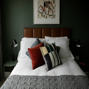
and it can have a powerful effect on how our home makes us feel. But when it comes to choosing paint colours for our homes, the focus is often on aesthetics rather than how the colours we choose will enhance our well-being at home.

A light terracotta with a delicate pink hue. Blush is a mix of red and yellow tones, which gives this pretty shade a warm earthy feel. It contrasts beautifully with both dark and light shades. Pair with Night Sky for a dramatic look.

Our most versatile white. Icing Sugar is a fresh warm off white that isn’t too creamy or clinical or cold. Use it on its own or as the perfect complement to almost any other colour in the collection.

Our most versatile white. Icing Sugar is a fresh warm off white that isn't too creamy or clinical or cold. Use it on its own or as the perfect complement to almost any other colour in the collection.

A delicate pink with a hint of grey. Dusty Rose grey mix creates a softness that makes it much easier to live with than many other sugary pinks.

A delicate off-white. French Vanilla has a slight green undertone which makes it work well with soft Irish Light. It's equally beautiful in bright or dark rooms and is the ideal shade if you are looking for an off-white that isn't too creamy.

A dark chalky terracotta. Earthenware has a mix of yellow and red undertones that gives this earthy shade a soothing warmth. It appears pink in brighter rooms and has a browner more terracotta feel in darker spaces.

A warm and muted mid-grey. The combination of yellow and red undertones give Dusk a lovely warmth. It creates a calm and soft atmosphere when combined with other warm based neutrals.

A warm grey-brown with red undertones. The warmth of this dark shade makes it incredibly comforting. Work of Art reads as a dark, dusty pink, especially when paired with a crisp white like Icing Sugar or Blank Canvas.
“Choosing colour is something many people struggle with – there’s so much choice that it’s easy to get bamboozled,” says O’Connor
This paint collection has been created to help people choose colours that will enhance the look of the spaces they paint and enhance how they feel when they spend time in the space.
“We wanted to find a way to get people to think about how they wanted to feel in their homes as the starting point for picking paint colours,”
“A kitchen will have a completely different atmosphere to a bedroom, for example. So we’ve created an easy to follow system to help people pick colours based on how they want their space to feel.”
“It’s amazing how a simple coat of paint completely changes the atmosphere in a space. Unless of course, you choose the wrong colour!” says Gaynor.
Clarity (C), Vitality (V) & Serenity (S).
Each colour in the collection is coded (C), (V) or (S) to show which of the 3 categories it belongs to. By using the codes it’s easy to identify whether a colour is calming, uplifting or inspiring.
Colours impact how we feel…
We’ve create an easy to follow system with 3 categories , that helps you to pick colours based on how you want to feel in that space.
Relaxing shades to create instant calm. Whether it’s a bedroom or living space, we’ve chosen the perfect shades to help you turn any room into a calm and restful space.
Choose serenity for rooms you want to feel: calm, relaxed, tranquil, clear, balanced, quiet, placid, peaceful and free of dusturbances. Composed, patient, peace of mind, a sence of stillness, comfortable, rested, still, satifsfied, stoic, untroubled.
Energising shades to lift the spirits. Choose from a selection of beautiful uplifting shades to help you feel energised, happy & positive.
Choose Vitality for rooms you want to feel: more intense and more passionate feelings – passion, enthusiasm, zeal, strength, vigor, endurance, fervour, enthusiasm, a hunger, a zest, spirit, fire.
Beautiful hues to promote focus and creativity. Our carefully curated shades will help promote productivity, focus and creativity, accuracy, brightness, precision, overtness, awakened & alert.