


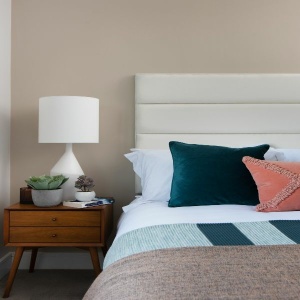
Sand Peel & Stick
€1.50
A warm, rich sandy colour. Sand, as the name suggests, has a subtle golden undertone. It works well in both contemporary and traditional settings.
| Weight | 0.014 kg |
|---|---|
| Product | Interior Paint, Metal, Wood |
| Size | 0.65L, 1L, 2.6L, 5L |
Complementary Palettes…
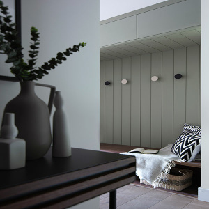
A dark olive shade with a hint of grey. Greenhouse is bold but calm at the same time. Pair with blues or yellow-based whites for a tranquil and serene scheme.
This product has multiple variants. The options may be chosen on the product page
An intense, dark blue. Inkwell works brilliantly as an accent wall colour. This dark neutral has a more sophisticated feel to some of the vivid dark blues in the collection. It's surprisingly restful when paired with warm greys and is the perfect backdrop for more vibrant shades like Limoncello or Holiday Mode.
This product has multiple variants. The options may be chosen on the product page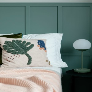
A chalky mid-teal with a grey undertone. Nature Walk is a soft and elegant shade that works well in both contemporary and traditional settings.
This product has multiple variants. The options may be chosen on the product page
A deep berry red. Damson has a blue undertone which gives this dark shade a slightly purple tone. It works well with other red-based neutrals and contrasts beautifully with yellows.
This product has multiple variants. The options may be chosen on the product page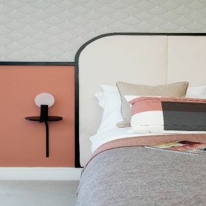
A light terracotta with a delicate pink hue. Blush is a mix of red and yellow tones, which gives this pretty shade a warm earthy feel. It contrasts beautifully with both dark and light shades. Pair with Night Sky for a dramatic look.
This product has multiple variants. The options may be chosen on the product pageRelated products
A pure white. Blank Canvas, as the name suggests, is the perfect shade for a clean look. Use it on walls for a contemporary feel or on woodwork and trims. It pairs well with almost any other shade in the collection.

A charming lavender hue. Amethyst is beautiful when used in bright rooms. It looks greyer in darker spaces but is never cold. Pair with fresh whites for a crisp look or soften with warm greys.

A soft grey with a subtle green undertone. Frost Bitten appears light and fresh when used in larger or sunny rooms and becomes stronger and more earthy when used in smaller or darker rooms.

A warm stone colour. Biscuit has a subtle warmth. For a timeless and cohesive scheme, pair with the lighter shade of Escape or darker tone of Distinguished.