


Marshmallow Peel & Stick
€1.50
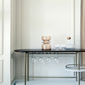
A red-based neutral. Marshmallow is a warm off-white with a creamy softness. Bright whites will bring out the red, making it look pink or pair with darker shades like Putty or Just White for a more mellow look.
| Weight | 0.014 kg |
|---|---|
| Product | Interior Paint, Metal, Wood |
| Size | 0.65L, 1L, 2.6L, 5L |
Complementary Palettes…
A dark chalky terracotta. Earthenware has a mix of yellow and red undertones that gives this earthy shade a soothing warmth. It appears pink in brighter rooms and has a browner more terracotta feel in darker spaces.
This product has multiple variants. The options may be chosen on the product page
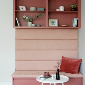
A soft, warm dusty pink. Confetti has a yellow undertone that gives this pretty pink a blush hue. Combine with warm greys, dark navy tones or deep greens.
This product has multiple variants. The options may be chosen on the product page
A soft grey with a subtle green undertone. Frost Bitten appears light and fresh when used in larger or sunny rooms and becomes stronger and more earthy when used in smaller or darker rooms.
This product has multiple variants. The options may be chosen on the product page
A yellow-based neutral with a hint of grey. Just Right is an incredibly reliable neutral. Pair with a warm white such as Lace, or try Icing Sugar for a more contemporary look.
This product has multiple variants. The options may be chosen on the product page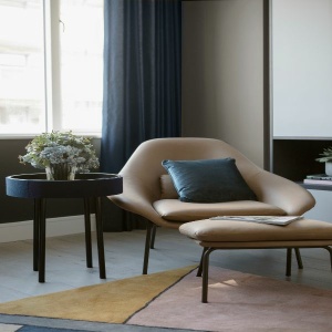
An earthy grey-brown shade. This dark neutral has undertones of green which creates a softness. The earthy quality creates a cocoon-like effect when used in spaces without much natural light.
This product has multiple variants. The options may be chosen on the product pageRelated products

A charming lavender hue. Amethyst is beautiful when used in bright rooms. It looks greyer in darker spaces but is never cold. Pair with fresh whites for a crisp look or soften with warm greys.

A subtle grey tone. Stepping Stone brings calm and tranquillity wherever it's used. Pair with softer accent shades like Limoncello and Coastal Calm for a bright yet serene look.

A deep dusty orange. Carnival is a warm and cheerful shade. It is beautiful when paired with a crisp white like Icing Sugar and very dramatic when used with black or dark grey.

This chalky cobalt blue. Twilight has a hint of mauve and comes to life when paired with whites and bright shades. In contrast, however, it is calmer and more restful when used in darker spaces.