


Confetti Peel & Stick
€1.50
A soft, warm dusty pink. Confetti has a yellow undertone that gives this pretty pink a blush hue. Combine with warm greys, dark navy tones or deep greens.
Confetti
| Weight | 0.014 kg |
|---|---|
| Product | Interior Paint, Metal, Wood |
| Size | 0.65L, 1L, 2.6L, 5L |
Complementary Palettes…
This chalky cobalt blue. Twilight has a hint of mauve and comes to life when paired with whites and bright shades. In contrast, however, it is calmer and more restful when used in darker spaces.
This product has multiple variants. The options may be chosen on the product page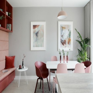
True Grey, as the name suggests, is a pure grey with no undertones. This mid-tone grey is exceptionally versatile and works well with both cool and warm shades. Pair with Blank Canvas for a contemporary look or the softer white, Icing Sugar for a more relaxed feel.
This product has multiple variants. The options may be chosen on the product page
A fresh pale yellow. Limoncello has a zesty, refreshing quality that comes to life in rooms with lots of natural light. Pair with Icing Sugar for a fresh vitality, ideal in rooms where you want an energizing atmosphere.
This product has multiple variants. The options may be chosen on the product page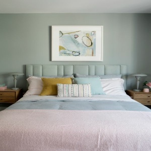
A silvery blue with a hint of green. Herb Garden is a peaceful and calming shade well suited to bedrooms. It is also stunning when used in darker spaces as it becomes more silver in tone.
This product has multiple variants. The options may be chosen on the product page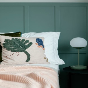
A chalky mid-teal with a grey undertone. Nature Walk is a soft and elegant shade that works well in both contemporary and traditional settings.
This product has multiple variants. The options may be chosen on the product pageRelated products

Our most versatile white. Icing Sugar is a fresh warm off white that isn’t too creamy or clinical or cold. Use it on its own or as the perfect complement to almost any other colour in the collection.

A charming lavender hue. Amethyst is beautiful when used in bright rooms. It looks greyer in darker spaces but is never cold. Pair with fresh whites for a crisp look or soften with warm greys.

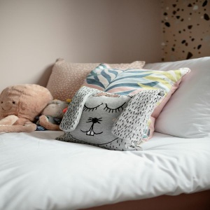
A delicate pastel pink. Bon Bon is a beautiful feminine shade and especially pretty when used in bright rooms. Pair with whites for a soft look or contrast with greens or stronger pinks for a more dramatic scheme.

A deep, dark berry shade. Blackberry can appear black in darker rooms and transforms to a rich berry hue in sunny spaces. Pair with Amethyst to bring out the purple tone or contrast with earthy neutrals like So Chic and Escape.