


Dusty Rose Peel & Stick
€1.50
A delicate pink with a hint of grey. Dusty Rose grey mix creates a softness that makes it much easier to live with than many other sugary pinks.
| Product | Interior Paint, Metal, Wood |
|---|---|
| Size | 0.65L, 1L, 2.6L, 5L |
Complementary Palettes…
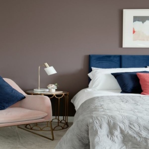
A warm grey-brown with red undertones. The warmth of this dark shade makes it incredibly comforting. Work of Art reads as a dark, dusty pink, especially when paired with a crisp white like Icing Sugar or Blank Canvas.
This product has multiple variants. The options may be chosen on the product page
A crisp white with a hint of true grey. Moon Mist is a subtle neutral with a fresh warm tone. It can be used as a wall colour for a contemporary space. It's equally beautiful when used on ceilings and woodwork when combined with greys or darker neutrals.
This product has multiple variants. The options may be chosen on the product page
A mellow dark blue. Blueprint is a beautiful wall colour choice and is equally striking when used on paneling or woodwork. The green undertones give this shade a calming and earthy quality, making it a surprisingly attractive option for smaller or darker spaces.
This product has multiple variants. The options may be chosen on the product page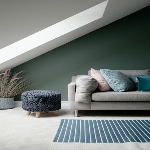
A dark, sage green with subtle grey undertones. Sage has an almost chalky quality that creates a softness despite its depth of colour. It is beautifully crisp when paired with whites like Blank Canvas and Icing Sugar.
This product has multiple variants. The options may be chosen on the product page
True Grey, as the name suggests, is a pure grey with no undertones. This mid-tone grey is exceptionally versatile and works well with both cool and warm shades. Pair with Blank Canvas for a contemporary look or the softer white, Icing Sugar for a more relaxed feel.
This product has multiple variants. The options may be chosen on the product pageRelated products

This chalky cobalt blue. Twilight has a hint of mauve and comes to life when paired with whites and bright shades. In contrast, however, it is calmer and more restful when used in darker spaces.

A light terracotta with a delicate pink hue. Blush is a mix of red and yellow tones, which gives this pretty shade a warm earthy feel. It contrasts beautifully with both dark and light shades. Pair with Night Sky for a dramatic look.

A deep, dark berry shade. Blackberry can appear black in darker rooms and transforms to a rich berry hue in sunny spaces. Pair with Amethyst to bring out the purple tone or contrast with earthy neutrals like So Chic and Escape.

A pale pink with the slightest hint of blue. Powder Pink is a fresh and pretty pink. It's beautiful when paired with crisp whites like Icing Sugar or Blank Canvas.